The Lion, the WItch and the Washroom: Part 4

It’s Week 4 of the One Room Challenge and pursuant to popular demand we have . . .
THE WALL TUTORIAL!
Brace yourself.
I preface this with the suggestion that YOU DO AS I SAY AND NOT AS I DO because our current wall situation resulted from a series of disagreements and mistakes which had a happier outcome than I deserved or could’ve expected.
And which I’m mostly certain you won’t want to repeat.
As the story goes, and as the story always goes, I arrived at my first color choice after much testing and contemplation.
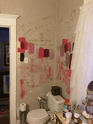
The winner was this lovely cerise by Behr called Glamorous in a eggshell (which notably is a very close match to Farrow & Ball’s Lake Red).

Glamorous by Behr. Btw when I use Behr paint, I always have the color mixed in the Marquee line as this is a great quality paint.
I then proceeded to put two coats of hot pink happiness on all four walls and it looked like this.

As you can see, the color is MUCH punchier and more coral in appearance than it is on the card sample above due to the lighting in this space.
Upon Mike’s return from daily toils, I asked for his approval which RATS RATS RATS was not forthcoming. He didn’t SAY he disliked the hottie pink but otherwise made it clear through implied gestures and gesticulations the color choice was mine and not his.
K. Plan B.
We had two gallons of a LUSH AND SPECTACULAR metallic ruby red in the basement which I was reserving for other purposes but this was EMERGENCY.

Modern Masters Ruby Red metallic. Bar none this is the most beautiful, rich red paint I've ever seen or used. It's spectacular if red is your thing.
Armed with glorious red paint and a partial scheme in mind, I researched YouTube videos about rag painting with the intention of using this technique on the walls.
But like most good advice in life, I ignored it and did my own thing.
And I LIKED IT!

Here are the walls half ragged. I didn’t do a traditional treatment, both in terms of the paint choice and technique, but simply rubbed the metallic red over the eggshell cerise in swirly random patterns with some painter's rags.
More importantly, MIKEY LIKEY!

Amazingly, the metallic ruby swirled over the cerise makes the walls look like they’re covered in crushed velvet.

Here are the walls completed after my improvised "rag" treatment.
I could’ve left well enough alone because the walls looked beautiful and rich with this sexpot red finish BUT I’ve never left well enough alone and saw no reason to start now. So I commandeered for the walls a fish scale stencil bought from Royal Stencil (which I intended to use on the hand painted floor).
Now it’s on to Plan C for the walls (and Plan B for the floor, but I’ll solve that problem later).
Step One of Wall Plan C was to mix paints for the scales. Royal Stencils has a great video tutorial online for this technique which recommends stencil paint they sell, but I didn’t have time to wait for stencil paint to arrive via the pandemic pony express PLUS Royal Stencils didn’t carry the pinks and golds and coppers I envisioned for our walls.
But I knew I’d need varying shades of red, pink and iridescent paint to create depth and the illusion of actual fish scales.
I therefore mixed my own pink and red using a combination of various Behr paints in satin and eggshell mixed with Modern Masters pearl pink and gold metallic. I just kept mixing and adding until I had the colors I wanted which were a medium to dark pink, a medium burgundy for the darker layer of the scales and just the right color of gold metallic.
The remaining paints (the Pink Pearl metallic and the Flash Copper) I used "as is" and did not mix.

Here are the colors I used for the scales. The painter's pale at the top is the deeper pearl pink I mixed by combining Modern Masters pearl pink and some of their gold metallic with latex hot pinks and corals. The next pale down is a gold I mixed using several shades of Modern Masters metallic golds. The third pale looks white but it’s Modern Masters Flash Copper which is a beautiful iridescent copper. The small jar next in line is Modern Masters Pink Pearl and the last jar is the rosy red I mixed by combining Modern Masters Ruby Red metallic with various shades of latex pink and pink pearl.
Since this was my first decorative wall painting adventure, I decided to do a faded fish scale pattern whereby some of the scales were complete but others faded in and out as this, I thought, would be more forgiving given my limited skills set.

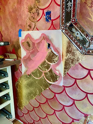
This is where I started with an initial coat of the rosy pink applied by dabbing and swirling with a high-quality chalk paint brush. I initially used tape to hold up the stencil but this was disastrous so I ended up applying thin layers of a 3M spray adhesive to get crisp edges. Because I used adhesive, I also used Goof Off to remove the adhesive periodically which helped prevent build up.

Here is a different section of the wall, although I applied the same process. After the rosy pink base dried, I dry brushed in swirls the lighter metallic Pink Pearl over the lower part of the scales on some of the scales and over the entire scale on others in a random pattern. I followed the pink pearl with dry brush swirls of the rosy red at the top V of the scales. Next I dry brush swirled gold metallic over the entire scale and last dry brushed in swirls the Flash Copper. It is KEY for all steps other than the initial rosy pink base to ensure you offload most of the paint onto a paper towel or cloth so the coats are transparent and that you use a chalk paint brush or a large stencil brush. Also key is to use a flash or iridescent paint as the top coat so you get variations as the eye travels around the room.
All was well for the first few hours of this process but then ALL HELL BROKE LOOSE when my brain-eye coordination tanked and I failed to line up the stencil properly and scales began to overlap.
I didn’t take pictures of this because I was too demoralized to document the tragedy.
I screw up many things in my life and thus I’ve learned to rally and come up with new strategies to produce favorable outcomes. This was no exception, so I devised PLAN D FOR THE WALLS by which I whacked up gold leaf on the trouble areas.
Which were ALL OVER THE PLACE.
The problem with this, however, is the gold leaf looked too jarring and contrived on the scales.
I painted over most of the wonky scales with the ruby red metallic before applying the gold leaf. Btw I used imitation gold leaf which is made of copper, so it's essential to apply a clear coat varnish over this because reportedly it will tarnish to a green color.
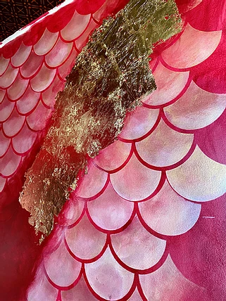
As a result, I went to PLAN E FOR THE WALLS. This involved “distressing” the gold leaf to make it appear that either the leaf or the scales were fading in and out over each other.
Here's a photo journey of the process I used through much trial and error.

Again this is another part of the wall, but I used the same process. As you can see, the gold looks like a bad rash and needs some sort of feathering or distressing to feel more natural.

I swirled and dabbed the same colors over parts of the gold leaf that I used on the scales plus the ruby red metallic. I continued adding layers until it achieved satisfactory eye appeal.

At some point during this process, I realized the effect produced by this technique was something geode-like in appearance. So I continued to shade and add colors here and there to enhance that effect.

Like most things in design, decor and art, layers are imperative. And fun. The more I played with this, the better I became at the process. If I made a mistake, I just folded it into the final product.

After finishing the layered paint overcoats, I still felt my "geode" didn't look organic enough so I layered more gold leaf in random patterns on top of the overcoat. As for the swath of red on the lower left, that will be covered by a radiator so I didn't waste time on that section.
On other areas of the wall, I stenciled more fish scales over the gold leaf to enhance the organic effect and create an illusion perhaps of a worn mural peaking from beneath layers of paint.

I didn't use the exact same technique on every part of the wall as I felt this would look too contrived.

Some of the wall feels more like worn out watercolors. I achieved this effect by continuously layering metallic and iridescent paint and bits of gold leaf.
The moral to this story is mostly any person can create an arty thing of beauty through trial and error and going in your own direction as the flow takes you. I'm not a decorative painter. This is the first wall treatment I've attempted other than coating white walls with glitter paint.
That said, you can apply the techniques I've described here or use artistic license.
I recommend the latter.
And most of all, have fun for crying out loud!