MIXED MEDIA COLLAGED CEILING

‘Tis my humble opinion that decorator white ceilings are neither inspired nor inspiring. There’s not been one in my life since rental days. Of course, this is excluding the attic bedroom at our last house, which was painted ALL white, including the floors, and then liberally doused with a glitter paint top coat.
Glitter top coats are the exception to the No White Ceiling rule.
But I’ll take all this one step further and make a bold pronouncement.
White ceilings are bad for your health.
That’s right!
But why?
Because there’s nothing about them that motivates you to look up. And according to studies in neuroscience, looking up is good for your health.
Indeed, looking down is what we do when we’re in a state of depression, despair, lost confidence and/or grief but “[w]hen we look up, our brain gets better at being playful, creative, and thinking critically.” Not surprisingly, builders of grandiose spaces (think massive cathedrals and other awe-inspiring historic public spaces) have always known the act of looking up causes us to engage with the infinite and all the big thoughts and contemplation associated with it.
God and the angels live in Heaven. And thus, so does our imagination.
So put down that smart phone and do something good for your health.
Get cracking on that fifth wall!
THE ATTIC BATHROOM CEILING — PLAN A
Every ceiling in our house has something going on, and truth be told, they keep getting more ornate as we move from room to room in our renovations.
The attic bathroom ceiling, however, was challenging to me. It peaks at 13 feet with a sharp, cathedral angle. I had recently finished the hand-painted 17-foot tower ceiling after three months of non-stop work and was in no mood to do another mural. Especially since I’d be doing a hand-painted mural throughout the main part of the room.
That said, a boring ceiling still wasn’t an option.
My first idea was based on the architecture of the ceiling, the lines of which gave me real art deco vibes.

(Here’s the bathroom from the vantage point of the attic bedroom. All of this will remain open. That’s right. No bathroom door! We actually had a similar design scenario in the attic conversion of our last house, and the lack of a bathroom door didn’t bother us. Plus, we wanted the tub to be open to the rest of the room.)
I just kept looking at these ceiling lines and imagining various classic art deco vectors like this.

(Shrug.)
And this.

(I have no idea where I found this.)
Or, God save the Queen, this.

(LOL! I must’ve been losing my mind at this point.)
I also was loving that classic art deco green, which can be seen in one of my favorite Hollywood bathrooms.

(Yes, this is the green bathroom in The Shining. So creepy beautiful!)
So, I set about painting the bathroom a classic art deco green. I settled on Pantone 344 U and had it mixed by myperfectcolor.com. This also happens to be the right color for the rest of the attic suite bedroom, which is inspired by the Belfry Chamber in the Sleeper-McCann House in Gloucester, Massachusetts.

(The Belfry Chamber. Pantone 344U is in the same genre as the mural background color (our color has slightly more blue undertone). I also liked the darker, crisper green in this photo and may try to incorporate some of that elsewhere in the attic by going 25% more saturated on the Pantone 344U match. We shall see.)

(Here’s is how things looked after two coats of the Pantone 344U. myperfectcolor.com only sells their mixes in the Benjamin Moore Aura line, so the quality of paint is excellent even if it is sometimes hard to work with (it can show lap lines when it’s rolled).
I then bought scads of tape in various sizes to tape off the vectors on the ceiling. I was DREADING starting this project as I envisioned a laundry list of assorted debacles, mishaps, and eff words that undoubtedly would permeate my life for a month.
Maybe more.
Thankfully, Mike stepped in and snapped me back to my senses.
He said, “wouldn’t something more artsy fit our house better?”
Errrr, yeah.
the bathroom ceiling — plan b
So, I pivoted. I had previously found this image on Etsy buried in the reviews of some decoupage paper and saved it in my pile of inspiration photos.

(I’ve tried unsuccessfully to relocate the source for this photo.)
It appeared to me this was a collage of gold or copper leaf and decoupage on canvas, possibly with additional layers of furniture transfers. I thought the art was beautiful and felt I could do something similar on a trash can or something.
But why not on the ceiling?
Afterall, I originally had wanted the attic’s design motif to be based on the dilapidated mansion in Guillermo del Toro’s Crimson Peak. I shifted from that, but felt a collage ceiling would at least lend an abandoned mansion feel to one part of the room. Of course, it’s more of stylized or conceptual nod to that aesthetic, but it works well in our house.

(Lofty or possibly unrealistic inspiration, I know. I still think this would be a beautiful aesthetic for a bedroom, but the Sleeper-McCann Belfry Chamber inspiration ended up winning the day for me [at least as the inspo for the main part of the bedroom].)
Sorry, not sorry. Digression was mandatory.
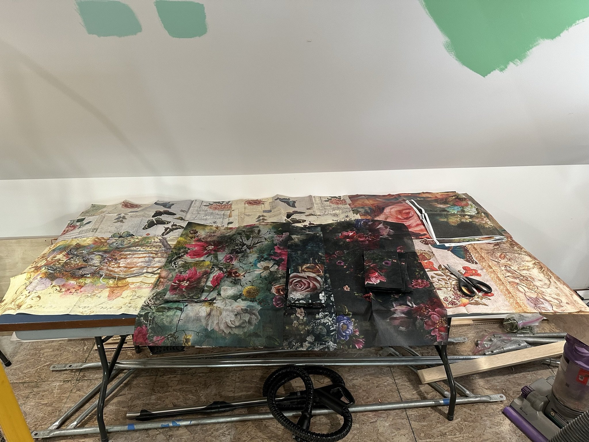
(My supplies work table, ready for action.)
Etsy and Amazon were my go-to’s for decoupage materials. I love the textured, floral decoupage tissue paper by Re-design With Prima, which has an Old World, moody and dark floral motif. This “paper” is thick and has a fabric-type texture. The rest of the decoupage papers were from random sources on Etsy, and I picked them based both on color and subject matter. Butterflies were mandatory, as were birds.
As for the decoupage gel, I tried a few and my favorite was The Crafter’s Workshop brand, which I purchased on Amazon.
Since this wouldn’t be a mural and I wanted the look to be random, I didn’t have any design plan in terms of where I’d place most of the elements. Thus, I started by scattering the decoupage papers and letting the process unfold.
Sometimes, you have to trust the process more than the “plan.”

(Here are the Re-design With Prima decoupage papers applied. In retrospect, as discussed below, I would have cut these into more random shapes so the lines that showed through in the finished product would have less deliberate shape [perfect squares look deliberate, and as with all decoupage collages, some of the cut-out shapes will show]. I worked on a ladder on top of scaffolding, which I highly recommend if scaffolding is feasible.)

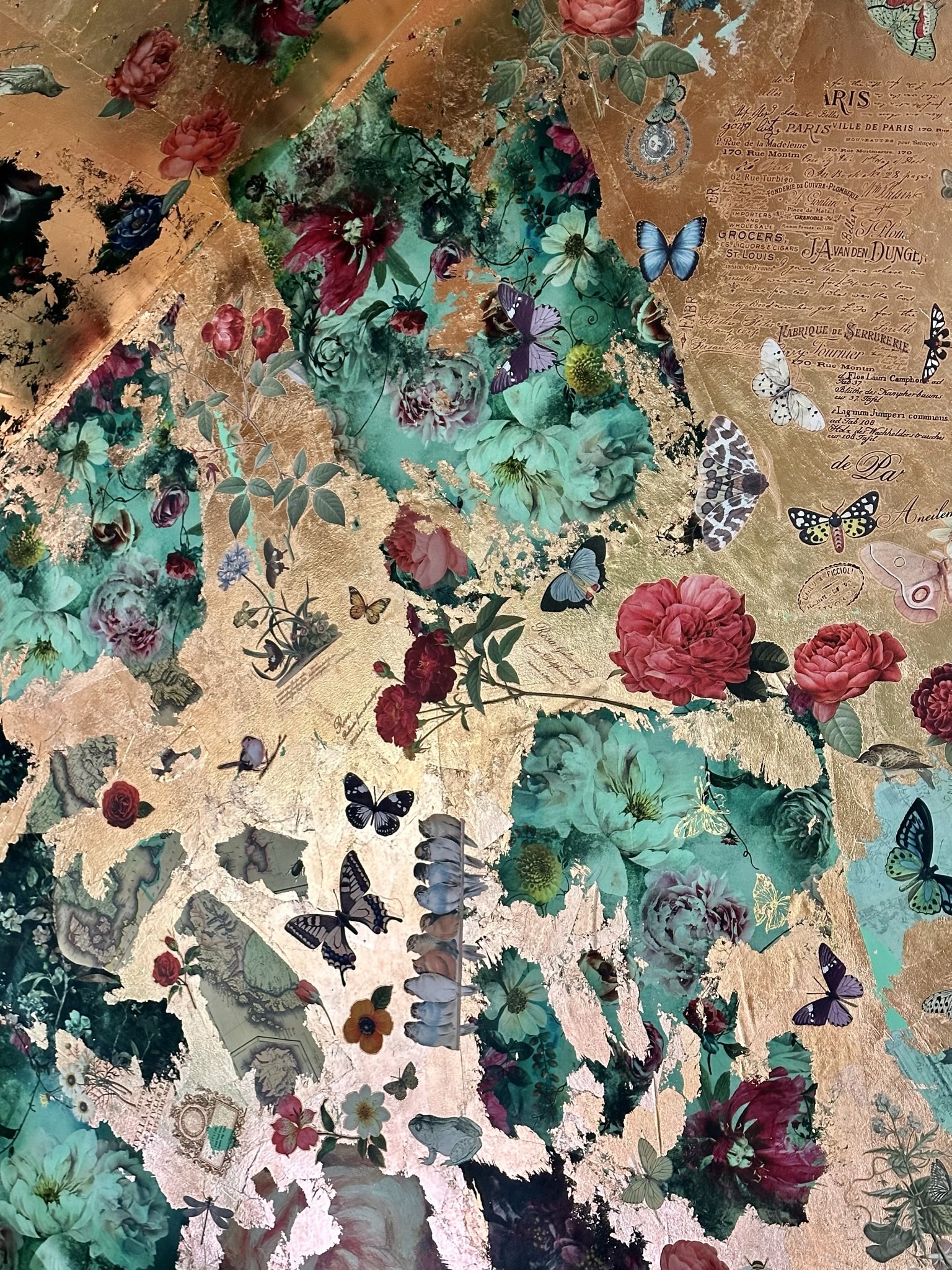
(Here, I’ve started working with random pieces of decoupage paper and also the copper leaf, which I purchased here on Amazon. In addition to the decoupage paper and leaf, I used furniture art transfers by Re-design With Prima and Iron Orchid Designs (IOD) which I purchased from various Etsy shops [many shops sell these, and I purchased based mostly on how fast the seller could deliver]. I layered the transfers directly on the copper leaf, and in some places, over the decoupage paper.)

(The layering process continued fairly randomly as I worked down the expanse of the ceiling. Some of the transfers I had left over from the tower ceiling project, as they didn’t work with the motifs in that room. I save all leftovers, as I always find some use for them in my artistic projects.)

(During the process, here’s how the bathroom ceiling looked from the stairs leading to the attic.)

(This photo illustrates just how hodge-podge the decoupage and transfers were. The maps are wrapping paper which I bought for decorative books and never used.)

(I just kept layering more elements.)
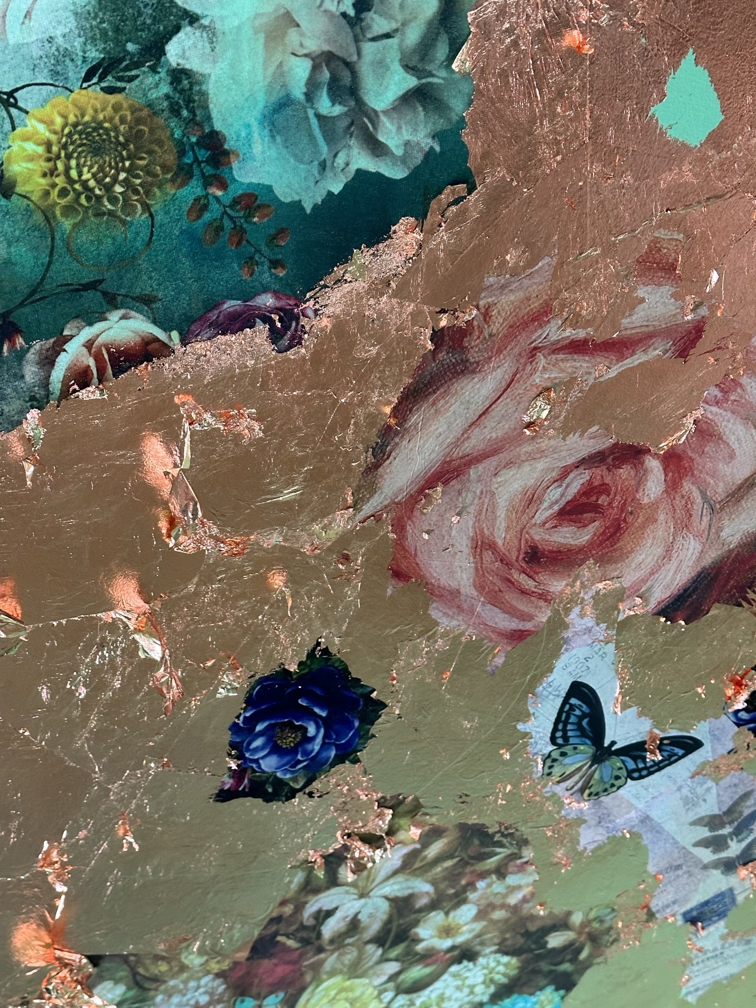
(Here, I’ve started working leaf between and over the decoupage paper. The goal was to make the decoupage elements peek out from pieces of copper leaf so, in the end, there would be a sense of layered wear [fancy layered wear, that is].)

(More layering of materials as I work across the ceiling.)

(These IOD birds were left over from the lounge front bar project. IOD and Re-design With Prima transfers are so much fun and are easy to apply over leaf.)

(I added text transfers for a more eclectic look and to balance out the motifs, as the transfers can be placed wherever you want them. The butterflies in this picture are transfers, but some in the ceiling are part of the decoupage paper.)

(More progress. It’s important to note the decoupage paper should be applied first and should not be layered over the copper leaf, since the gel is water-based and thus will discolor/tarnish the copper leaf.)

(As I got further into the process, I realized I wanted a denser look with the elements closer together, so I ended up buying more transfers to fill in the gaps. The transfers can go over the leaf, but the decoupage paper cannot.)

(The view looking upward.)
(Magnolia Pearl’s quote about not being afraid to layer something beautiful over something beautiful applies here.)

(In fact, layering over elements I was tempted to leave uncovered was mandatory, as it makes the ceiling look less intentional and suggests more of a feeling of wear [even if it’s faux or theoretical wear].)

(I loved the dark floral look where the ceiling peaks and juts out, but I knew it just didn’t look right. Bummer. I’d have to cover a lot of that paper to make it look less contrived.)

(This area would be directly over the vanity sink. Fairies and peacocks are mandatory.)

(This is a good example of why we shouldn’t be afraid to layer something beautiful over something beautiful. I didn’t want to cover up the floral decoupage paper and, as a result, the sections looked too squared-off and thus, intentional or contrived. I’d have to layer more copper leaf over the floral decoupage paper to make it all seem more spontaneous and stratified.)

(Here, I’ve finally bitten the bullet and layered A LOT of copper leaf over the floral decoupage paper [this view is from the opposite direction compared to the prior photo].)

(The lower left is the area over the shower. It’s one giant transfer with additional butterfly and dragonfly transfers layered throughout.)
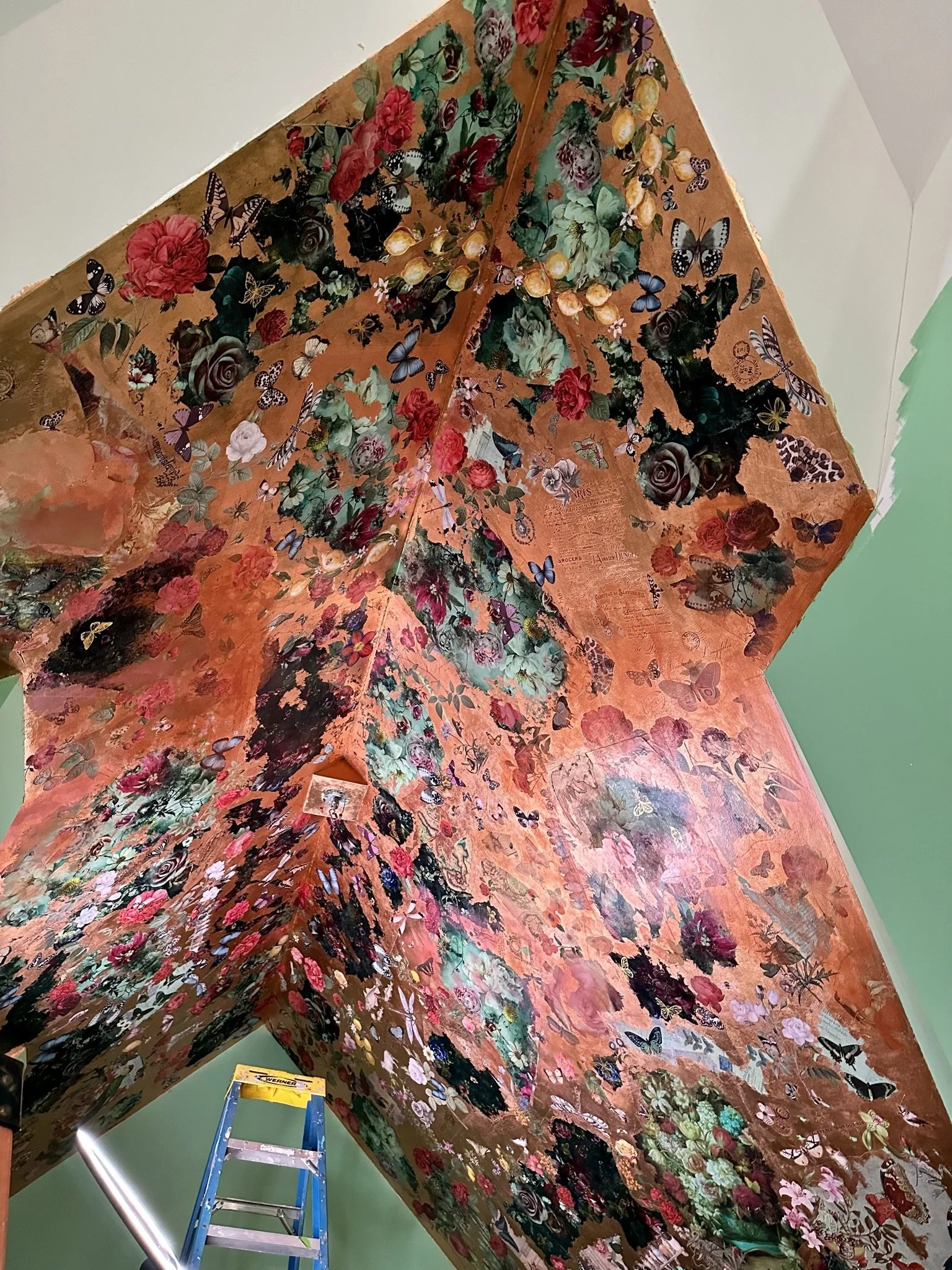
At this point, the ceiling was ready for the top coats. Because this is a bathroom and will be exposed to moisture from the shower, I wanted to apply three coats of varnish across the ceiling, and then an additional 2-3 coats over the shower area. Varnish is mandatory if you want to avoid tarnishing, which will happen over time with any imitation gold leaf or copper leaf (the speed with which tarnishing occurs depends on specific room conditions – there are walls I’ve leafed in the house without any top coat which aren’t adjacent to moisture sources or touched, and these areas tarnish much more slowly).
I’ve done quite a bit of gold and copper leafing, both on the walls and for decorative projects, and determined Polyvine coatings are the best for applying on imitation gold or copper (based on a recommendation from one of my Instagram followers). Polyvine causes the least amount of discoloration and enrichens the color of the leaf, even if it does knock back the shine (a lot).
At least, this was the case BEFORE I coated the bathroom ceiling.

(The ceiling, pre-top coat.)
I don’t know what the reason is, but the Polyvine instantly tarnished some areas of the ceiling. That’s never happened before. I suspect this is because the ceiling was decoupaged in many places, and the brush, when wet with the Polyvine coating, activated/moistened some of the dried underlying water-based decoupage gel which then mixed with the Polyvine.

(This photo shows the streaks of discoloration/tarnishing from the varnish process.)
Fortunately, the discoloration and streaking didn’t get worse with additional top coats, but it still bothered me. As such, after finishing the top coats, I used a chalk paint brush to swirl additional layers of a metallic rose color and metallic copper throughout the ceiling. To keep this layer light and sheer, I used paper towels for offloading most of the paint. This additional layer helped disguise/distract from the discoloration and also enrichened the overall look of the ceiling.

(Close-up of an area where I layered the acrylic copper and rose metallic paint over the top coat. This paint is called “goop” and has a thick, paste-y consistency.)
(Here's the ceiling after three coats of varnish and the additional [thin] layering of copper and rose metallic paints. There are areas where you can see the outline of decoupage sheets, but this is unavoidable for the thicker, fabric-like sections [the Re-design With Prima dark florals]. I could’ve avoided this by using thinner decoupage paper, but I liked the dark floral motif and was willing to sacrifice the seamless aesthetic for it.)
At this point, I felt there were areas of the ceiling that needed more layering or fill, so I decided to paint a few hummingbirds over the top coat.

(I used stencils to outline the birds, then hand-painted them. At that point, I wasn’t experienced enough to completely free-hand them, but now that I’ve finished the bedroom ceiling, I’m able to free-hand paint birds of all shapes, sizes, and floof.)
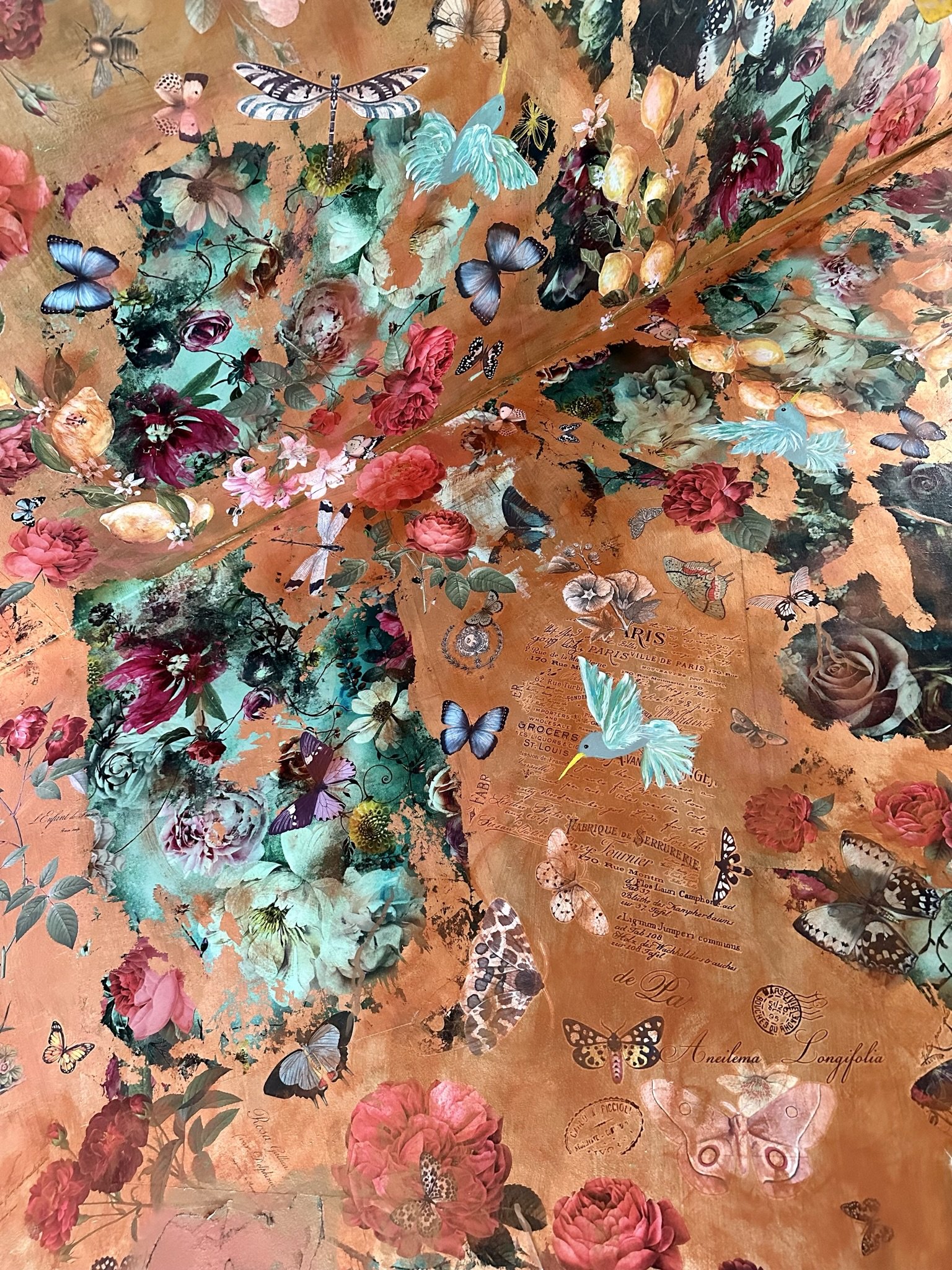
(More post-top coat layering with the rose and copper paint, and hummingbird painting.)

(The top coat sheen is satin. I felt this would provide more protection in a bathroom than the matte sheen I used in the tower.)

(More fairy power.)

(I really liked the owl decoupage paper, so there are two of these guys in the bathroom. The gold butterflies are foil transfers. The peacock transfer is part of a tableau.)

(I think this ceiling would be EVEN MORE FABULOUS against black walls.)

(I was surprised by how much people love this ceiling. I feel the ceilings in the tower and the bedroom are more interesting, but for some reason, this is the one that draws people in. Go figure. I guess that’s good news, because this ceiling is much more attainable from a DIY standpoint.)

(The warm and pinkish cast this ceiling takes in certain lights is a good counter point to the cool, green walls.)

(This shows how visible some of the outlines are from the decoupage. It’s unavoidable, but if I was to do this project over, I would cut more random patterns out of the Re-design With Prima floral decoupage paper rather than setting up the full square.)
The hummingbirds were the final flourish. Next up was a small peacock mural on the wall and the chandelier which I embellished with costume jewelry.
The attic bathroom ceiling is DONE. Onward and forward (or sideways) to the bedroom ceiling.

(This mural was my first attempt to paint one-stroke roses. Needless to say, I practiced more before I painted the main bedroom ceiling).

(You can read about how I created the chandelier here.)
