The Re-Redecoration of a Guest Bedroom: From Dark and Disturbing to…Squirrel!

I’m pretty sure the best interior designers are just as left-brained as they are right-brained.
They analyze space, scale, proportion, natural light (and probably lots of other variables I can’t think of) whilst, at the same time and with no effort, letting their gifted arty minds fly free to envision fab chromatic combos and unique whimsical spins on ordinary objects (like footstools that look like farm animals).
They’re savvy.
Deliberate.
So wise.
They aren’t scatterbrained.
Meaning this. They don’t get tricked into buying 23 gallons of paint in any old color just because a local home improvement center with limited color-matching technologies is having its Annual Fourth of July Red, White and Blue Paint Rebate Sale. Nor would they ever settle for semi-gloss when they want eggshell just ‘cuz Home Depot ran out at the tail end of the sale.
Continuing the hypothetical, even if our mythical decorating superstar was to have such a momentary lapse of reason, he or she wouldn’t go total dingbat and get distracted by BOGO neon hot posy pink and acid grassy green throw pillows on sale at MacKenzie-Childs.
Right?
I mean, there’s no way any true design luminary would spend days obsessing over MC’s floofy garden-inspired cartoon abominations before she finally tear-asses off the couch and breathlessly busts out the Visa.
Right??
After all, there is a reason this sort of crap goes on sale.
Right???

MacKenzie-Childs Moss Meadow Round Pillow and Bolster. I mean, in theory, these are super fun. But in a room? They look like someone ate a flowering shrub then projectile vomited all over the furniture.
But . . . wait a minute!
Let’s assume our hypothetical design superstar had a little fricken’ ADHD for a sec and actually stumbled into such an amateurish paint and pillow blooper. Do you think he or she would then let such gaffes dictate the decoration of an entire room?
Uhhhhhh, no.
Not gonna happen.
Because the best designers are both edgy and disciplined. Fantastical and self-controlled. Original and focused.
Bitches.
How to decorate a dark, cramped room: Paint it light, bright, and airy!
July 6, 2016. Yeah!
Hi ho, hi ho, it’s off to Home Depot we go!
Doop, de doop, de doop.
I’d been engaged in a very high level analytical and painstaking paint color selection process for about a month.
That’s such a lie.
I started obsessing over colors the first time I saw our gorgeous Victorian on Zillow about 7 months earlier. I then continued my Pantone preoccupation in a nonstop trance until Mike finally snapped me out of it.

Reds, blues, greens, pinks. Black. Orange. Purple. Pastels. With all the multi-colored splotches on the walls and torn wallpaper, our new home was starting to look like a crack house.
“Today’s the last day of the 4th of July sale,” he reminded me in a stern tone. We were getting ready to paint about 3,000 square feet and ten bucks a gallon off Behr Marquee interior paint was prettttyyy hard to resist. I really wanted Benjamin Moore, but that would require driving an hour to Traverse City or an Internet order, neither of which I was willing to do.
Seriously. What kind of eccentric orders house paint online or spends two hours driving to get it when Home Depot is only 5 minutes away?
Duhhh.
So, with purpose and conviction, I marched with my hubby into HD. Clutching my stash of annotated color cards, I beelined to the paint section where they already knew me very well. I was the one who bought 98 sample pots and appeared unemployed. Hard to forget.
Not as embarrassed as I should have been, I began peeling color cards off the deck and slapping them on the counter one at a time.
“We’ll take 4 gallons of this in eggshell and 2 gallons of that in satin and a gallon of this in eggshell and can you match this and that and this and that and that, that, that?”
Whack, whack, whack went the cards until the counter looked like the full visible light spectrum.
I chatted away, trying to stay focused and not get sidetracked at the last minute by the other 3,000 colors in the giant card caddy behind me. That was really hard.
"What? You don’t have this in eggshell? Or satin? Sure! I’ll take it in semi-gloss," I say.
The lady gives me an uncertain look then says, "Is this going in a kitchen? A bathroom?"
No, I explain. It's going everywhere except the kitchen and bathrooms.
"Okaaaay," she said before continuing, "I guess your walls will be very, uhhh, . . . wipeable, but are you sure?” She then goes on to explain the differences between semi-gloss and eggshell and what finishes generally go where.
“Yeppers,” I say. “I know, but it’s on sale. Have to take advantage of that sale!”
An hour plus and about $800 later, I was skipping and twirling out the door.
Woo hoo! I LOVE to paint and I can’t wait!

Here’s the loot, ready to be loaded into our trailer. Back then I didn't know that, by the time we were three quarters finished with the house, we’d have bought enough paint to fill that flatbed trailer in the background.
August 2016-ish. By the end of August or so, I’d finished roughly a third of the interior painting all by my little self. I mean, it would’ve been a third if I hadn’t repainted half of it. And I still wasn’t too happy with the Lapis Lazuli semi-gloss spanning the walls and ceiling of a vast entry hall, staircase, and upstairs hall. It looked like an oil slick exploded in our house.
But I had to move forward. The pressure was on. Our friends Mike and Lynn were planning a fun-filled drive out from California to visit us in September and I wanted to make their stay simply delightful. Which means I had to do something with the second-floor guest bedroom, starting with paint.
The guestroom was pretty dark and dreary, even on its best day. Its two big windows don’t let in much light, mostly because there is an almost zero-lot line three-story Victorian about six feet to our east. Handy in the event of a fire, because our guests can just jump out the window onto the neighbors’ roof. But it’s not great if you’re shooting for light, bright, and airy.
And light, bright, and airy is just what I wanted.
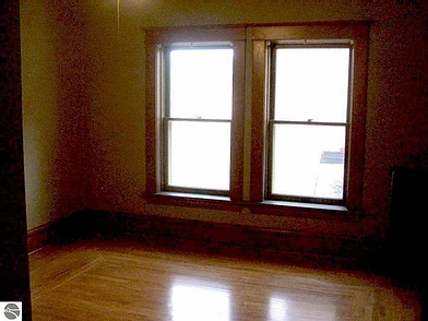
A real estate photo of the battleship green guest bedroom at our current house. Because I wasn’t planning to write a blog back then, I didn’t do great photo documentation before painting this room, either the first or second time.
My first plan for banishing this drabbery was to paint it a hap, hap, happy, soft pastel yellow. I loved the cheerfulness of the guest bedroom at our house in California and figured I’d get the same result if I carbon copied the paint color. I therefore had the HD lady color match Benjamin Moore’s Provence Crème with the hope our new guestroom would turn out like the old one.

(A picture of the inspirational guest suite at our former home in Orange, California taken with a turbo wide-angle lens. Please take note of the armoire in the right of the photo, because it’s coming around again, except in hot pink.)
It didn’t.
I got one wall painted then stopped. I realized painting a smallish, poorly lit room a light color doesn’t always translate to a bright and sunny space. Sometimes, going with light-colored paint in a dark room just makes the walls look dreary and dirty, which is how they looked in this case.
Moreover, there is at least one layer of striated, textured wallpaper under who-knows-how-many layers of paint on paint on paint going back over 100 years (not to mention a few ginormous plaster cracks). The light wall color just accentuated these flaws and made it all look even crap, crap, crappier.
Despite this, there was NO chance of me sanding the walls and stripping wallpaper that probably was installed some time before the Bolshevik Revolution. I was equally unwilling to go back to Home Depot for even more paint. At least back then, I was way too ashamed for THAT.
So, I dug through my existing stash of paint cans in the basement and found an ‘ol favorite: Benjamin Moore’s 2011 Color of the Year, 2016-20 Vintage Wine!
How to decorate a room that will NEVER be light, bright, and airy: Paint it darkly glamorous!
I had experience with Vintage Wine. Back in 2007, I took a few days off work for some much-needed painting therapy and put it on the den walls in the California abode. Now, this was against the advice of my beloved friend and roommate Catherine, who is one of those superstar interior designers described above.
“Meh,” was, more or less, her response when I showed her the paint swatch. “Too muddy,” she announced.
But I had undeterred faith in anything remotely purple, so up it went.
Catherine and I were mesmerized by the result. In some lights, it was purple. Then, depending on the light, it would read brown. And as the evening progressed, gray, and in some lights, almost black.
So mutable and intriguing! Yet, neutral enough to work with the most colorful art.
I loved, loved, loved it!

(The den at our Orange home painted in Vintage Wine. I painted the ceiling Benjamin Moore’s Alligator Green because I cannot stand white ceilings and because greens look awesome with purple tones.)
I was sure it would work again.
It didn’t.
You see, the beauty of Vintage Wine is its mutability. I didn’t really consider the fact the guest bedroom gets so little light when I put it on the walls and ceiling. Ugghhh. I don’t know how to describe it, except the whole thing looked like a funeral. I needed Prozac just to walk past the room.
What to do? I couldn’t repaint. Not again.
Surely, there was a band-aid fix for this.
I was all into band-aids.
Couldn’t I just add a little tiny . . . POP OF COLOR???
How to decorate a funeral parlor: Add merry pops of pink and yellow and blue and orange and green! Oh my!
October 2016. It was a most unfortunate Eureka! moment.
Swiping and tapping my iPad, I was busy seeking retail salvation on the clearance page of one of my favorite online retail establishments: MacKenzie-Childs.
Surely, there’s something uplifting here, something that will give the guestroom a dash of gaiety.
Swish swish, Tap tap.
Hmmmm. What’s this? A Moss Meadow Round Pillow? Lime green and bright green and yellow and orange and pink and turquoise with tiny bits of black and white checked piping? OMG! It’s so fuzzy! So joyously bright and cheerful! And in the form of a throw pillow!
Most excellent!
But I couldn’t. How silly. It didn’t work with anything in the house. Not even the dog beds. And, while it was 50% off, at $147.50 discounted, this was not going to be a cheap thrill.
For two days, I stalked the clearance page to confirm the Moss Meadow collection sold out, therefore precluding me from making a non-returnable impulse purchase I’d surely regret.
It didn’t sell out.
Rats!
I’d have to hurry and buy it before someone else did.
I regretted the transaction even before UPS delivered the results. But why not compound my error by ordering the Moss Meadow Bolster Pillow to go with the round one?
I bought that one too.
Now, MacKenzie-Childs’ stuff is delightful. It’s all fairy tale checked and flowery and sunny and crooked and colorful and wonderfully quirky. Just a ‘lil bit edgy and whimsical, but mostly, it’s quite tasteful.
Not this time.

And there the pillows sit, like turds in a flower bed. Rather than removing the pillows, I added a hot pink throw and confiscated a pink and green floor lamp from the parlor. As you can see from the shams, my subconscious mind was shouting, blue, blue, blue! I want blue! I just didn’t know it yet.
And that was it. Teal blue shams on burgundy bedding. Red curtains. Art composed in many colors. Purple walls that looked dark brown all the time. Of course, if you Photoshop out the pink, yellow, orange, and green technicolor pillows, the room probably wouldn’t have looked that bad. A little dark maybe, but not jarring and weird.
One would think I’d have just stopped there. Just concede failure and take the fucking pillows off the bed.
Nope. Ain’t gonna do it.
Cuz I’m a fighter.
Besides, I’ve got a better idea.

In my defense, there was a lot of hot pink going on in the room. It’s not like the armoire came out of nowhere.
Remember that pretty, softly-painted pastel yellow mirrored armoire in our guest bedroom at the old house? I’ll just spend three days painting it bright pink. Yeah. Just like the pillows.
But … I really like that blue on the shams. So pretty, so elegant, so . . .
Squirrel?
SQUIRREL!!!
Okay, okay! I’ll just paint the inside of the armoire teal blue. No one will know. And then I’ll paint an old minty green 50’s dresser metallic blue and red with gold leaf highlights to match the shams.
Oh yeah! That should do it.

The "before" version of the 50’s dresser, which we had at a largely undecorated mountaintop get-away house we used to own in California. It was supposed to be a “vacation” house in the clouds, but when there, all I did was work from a home office.

The "after" version of the 50’s dresser. It matched the inside of the hot pink armoire. Why just the inside? I don’t know.
How to fix a chromo-crapfest: Follow that squirrel!
May-ish 2017. Now, mind you, by this time, I’ve already ripped apart and painted the master bedroom twice. I had to explain to Mike that I also needed to tear down the guest room and repaint it.
Oops. My bad.
And I needed an itsy bitsy teeny tiny favor from him. No bigee. Just some crown molding to give the ceiling and walls a little separation.
Not more than a weekend project, right?
WRONG!!!
Mike was concerned nailing up a wood crown would be a royal pain in the ass due to the fact we live in the Lemony Snicket house. As a result, we got lured into Architectural Depot’s lightweight polyurethane molding, which Mike believed would be more bendable and forgiving on our super wonky and crooked walls. Plus, they had pre-formed corners, meaning Mike wouldn’t have to do the miter cuts.
Sign it up!

I think this might be our house.
The crown arrived. I was disappointed to see that none of the corners matched up to the long pieces.
Mike, on the other hand, was just pissed off. I mean, he wasn’t thrilled to begin with because he was, after all, in the throes of executing our major kitchen remodel. He really didn’t need this squirrel.
And I knew it. I cringed when I heard cussing punctuating the sound of the circular saw on the front porch. WHAT THE F*CK? WHO THE F*CK DESIGNS THIS KIND OF F*CKING SHIT MOTHER F*CKER F*CK F*CK F*CK F*CKITTY F*CK!!!!!
And so it went. Every weekend for two months.
Meanwhile, I kept myself busy with the new paint color selection process. By this time, I’d discovered the glorious color palette of Farrow & Ball, which cannot be color matched and, of course, has to be shipped internationally.
Oh. And it’s $100 a gallon.
So much for $38.99 a gallon Home Depot Fourth of July sale paint.
Whatever.
FedEx delivers to Cadillac.

(Here we go again. This time, it’s a Farrow & Ball sample pot lineup.)
Anyhoooo, it’s a good thing it took Mike two months to finish the crown, because it took me a month to decide on the color. Which is surprising, because I already knew what I wanted. I just couldn’t let myself have it.
Not sure why I deprived myself like that.
June - July 2017. After much hemming and hawing, I chose St. Giles Blue. In the photo below, it’s the second splotch from the bottom on the left and also over the red on top of the radiator.

The contenders.
Farrow & Ball describes this lovely and vibrant shade as follows on its website (with the important part highlighted in bold).
“A vivid blue
This clean and vivid blue is inspired by a colour originally found in the hall at 17th century St Giles House in Wimborne St Giles, Dorset. Its striking blue hue cannot fail to make you smile and will hold its own even in the darkest of places, so is often used as an accent in the back of bookshelves.”
Okay. It says it’s often used as an accent to brighten the back of bookshelves but I covered the walls and the ceiling in their entirety. Small detail. Besides, the first part says it was found in the hall of a 17th century house in St. Giles.
Our house isn’t in St. Giles, but it is old.
And I like to travel. At least in my head.
And I want big smiles. Everyday.
Believe me. As a recovering litigator, I’ve earned them.
Therefore, blue everywhere baby!

(Primer and first coat. As you can see, I have become such a painter extraordinaire that I don’t need to use tape. Practice makes perfect! Just call me The Cut Line Queen.)

(Looking good! Having learned my lesson via the semi-gloss blunder, I chose the Estate Emulsion finish which is super duper flat but easy to apply. The color is so stunning and saturated it makes my heart swell, and it also hides the numerous bumps, blips, and other flaws in the plaster.)
(Mike made me take this picture to document the fact I don’t cover floors when I paint. This isn’t a problem, except when I forget the FULL tray of paint on top of the ladder. This time, the whole shebang came down on my head. Imagine my confusion and surprise. I was covered in blue paint. It was even in my underwear. I scrubbed the mess in a total panic when suddenly I had a paralyzing thought. What if Mike takes a picture of the blue me and posts it on Facebook? Code Blue! I therefore stripped naked in front of two big uncovered windows, ran down the hall, and washed my hair in the sink before calling him to the scene. Crisis averted.)
Tying it all together: Custom painted furniture by . . . me!
Now that I had pulled the trigger and repainted the room, I finally had a partial vision of how I wanted it to look and feel, although truthfully it sort of evolved. I figured out halfway through this process I was shooting for Venetian theatrical elegance with just an itsy-bitsy smidgen of Ringling Brothers Barnum & Bailey.
This meant I needed to repaint the armoire. Again.
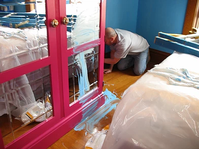
Much wiser this time, I chose the same blue, red, and gold metallic paint I had used on the dresser. The whole process took about a week because the armoire needed several coats of paint and a whole lot of taping and tedious cut lines.

I chalked a grid on the side of the armoire and then free-styled a harlequin pattern in the little squares with gold leaf paint. BTW, the key to getting sharp cut lines with tape is to paint the underneath color on top of the tape, let it dry, then paint whatever color you are taping off.

Progress picture.
In addition to repainting furniture, I replaced the coverlet on the bed with overflowing teal velvet to match the shams and ordered some teal faux silk drapes that contrasted prettily with the existing red drapes. I also purloined the black and white checked area rug from the entry hall because the checkered motif is all over the room and I felt the pattern needed to be grounded to make sense.
To keep it balanced but still interesting, I mixed black and white checked items de décor such as candlesticks, lamp shades, and other doo dads with some black and white hounds tooth pillows and a zebra print throw blanket.
Oh, and one other thing.
I ordered a new throw pillow to match the throw blanket on the end of the bed and to coordinate with the rest of the decor. (Both are from a company in Texas called Reilly-Chance; they make exquisite bedding with an old world feel.) Of course, the pillow was 50% off, because I’m OCD about discounted throw pillows. However, this time I made sure the pillow matched the existing décor and not the other way around.
I’m learning!
Fortunately, we didn’t need to buy additional art to go with the paint. I moved art from other areas of the house as the room formed in my imagination. I also put some gold leaf paint on a mass-produced tea cart next to the bed in keeping with gaudiness of the rest of the space.

(Stick a fork in it! She's done!)

(The art to the right of the armoire is Blue Clown by Oleg Zhivetin and Evolution by Michael Chevall. The photo is all stretchy because I got a new wide-angle lens but haven’t figured out Photoshop despite step-by-step instructions from my mom.)

(The tea cart all painted up. Some of the accessories are MacKenzie-Childs and others I picked up here and there from Etsy, Houzz, and Design Toscano. The wonderful prize pig tassel hanging from the lamp is from The Savannah Tassel Co.)

(The art over the radiator is Linda LeKinff. I bought it years ago at a Park West art auction and had it re-framed by our local frame shop, Brinks Art & Frame Shop. They do splendid work. The piece in the window is an original watercolor by an artist named Hendrik Grise.)

Two pieces of art by Zamy Steinovitz and a super fun feathery floor lamp from a boutique back in Old Towne Orange, California.

(Any self-respecting Michigan girl can shoot. I bagged these three on my last Internet hunting and gathering trip on Etsy.)

(Another angle. I painted the ‘70’s bifold closet doors a nice shade of blue.)

(The beautiful oil painting over the dresser was painted by my grandmother. I’ve carried that piece around with me since my college days. I absolutely love it.)

(No eclectic room is complete without a little Day of the Dead art. Especially when it doubles as American Idol memorabilia. Mike and I bought this at an Old Towne Orange shop called Gallery on Glassell.)

(The lamps are vintage topped with some MacKenzie-Childs shades that I bastardized with fringe and velvet roses. Are the finials the bomb or what? I got these from an Etsy shop called RWSMETALS here in Michigan.)

(The outrageously cool sparkly vintage “Yesteryear” tins on lamp bases, with my own replacement finials, are from the Veronica Flam showroom in Atlanta. These were created, as I understand, by designer Nick Alain’s mother. I thought the tins had a groovy 50’s-60’s vibe that worked nicely as a bridge between my grandmother’s mid-century painting and the glitzy feel of the rest of the room.)

I’ve collected vintage Art Deco Holeproof Hosiery illustrations and advertisements by Coles Phillips and sprinkled them here and there on the walls. My great, great grandfather started the company in Milwaukee at the turn of the century. The switch plate is Susan Goldstick

More Holeproof Hosiery illustrations by Coles Phillips. The top is an advertisement in the September 1925 Ladies Home Journal. The lower piece is a 1921 illustration that appears to have been kept in an album or book by the company or maybe by the artist.
Epilogue
Our newly redecorated guest bedroom probably doesn’t conform traditional design rules for a bedroom. I’ve been told by at least one critic (tisk, tisk) that bedrooms should be decorated in a calm and restful manner. Indeed, most of the print and web sources about painting and decorating a bedroom advocate serene colors and soothing décor to facilitate a calm mood, relaxation, and sound sleep.
Here’s my thought on that.
At least in our case, we turn out the lights and close our eyes when we want to sleep. How is a soft and pleasing palette going to encourage restful slumber when we can’t see it?
I want a room that make me happy when my eyes are open.
Mike tells me he likes the room because it has the feel of an opulent old world fantasy with a little elegance and mystery mixed in. He says it makes him feel like he’s in another time and place. I like it because every time I walk up the stairs or pass it on the way to the powder room, it’s vitality and energy makes me smile.
At the end of the day, I didn’t take the designer’s straight path from A to B. In fact, my path looked a lot less like this . . .

than it did this . . .

But it was fun.
And I got good a good arm workout painting the ceiling.
Twice.
Most importantly, I learned the following fundamental Rule of Interior Design: If pricey items of décor don't work in a room and can’t be returned, just stick them in the basement.
They might be happier down there.
You surely will be.
* * *
